

TMG Logistics and Maritime Group Inc. is a freight forwarding, warehousing, and cold storage company built for businesses that treat their supply chain as a serious operation, not just a line item. Rooted in the idea of the anchor and the letter T at the heart of its own name, the brand creates a mark that feels permanent, disciplined, and built to last.
Inspired by the language of the world's biggest carrier brands, the identity reflects precision and quiet confidence. It is designed to feel premium while remaining fully credible as a working logistics operator, anchored by the belief that a supply chain partner should look as dependable as the service it delivers.
Understanding the Need
TMG needed a visual identity that could stand out in a logistics market crowded with generic, purely functional branding. It had to feel premium and enduring without losing credibility as a real, working freight and logistics operator. The balance between luxury positioning and operational trust was essential, reflecting both the brand's ambition and the seriousness of the industry it operates in. The challenge was clear. How do you design a logistics brand that feels like luxury, without reading as decorative or forfeiting the trust a client needs to hand over their cargo?
Crafting the Creative Direction
The direction was built around the anchor, the clearest maritime symbol there is, merged with the letter T, TMG's own initial. Paired with a confident, text-forward wordmark in the spirit of DHL, Maersk, and Cathay Pacific, the identity blends restraint with distinction, reflecting the brand's promise while still feeling grounded as a working operator. Every design decision reinforces one idea, a system built for generations, not a trend.
The Challenge
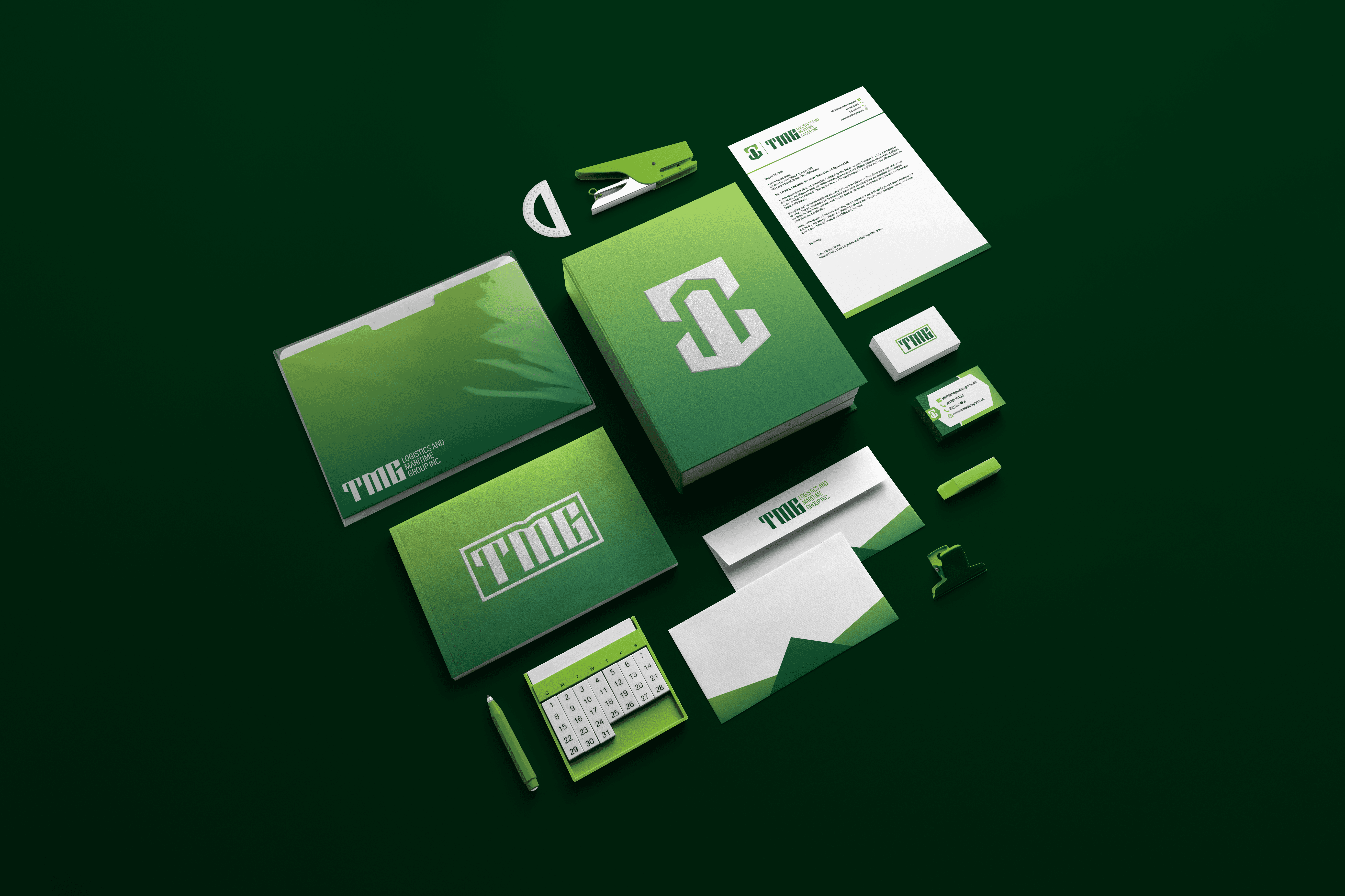
One of the main challenges was working within a brief that called for a text-first logo, styled after wordmark brands like DHL and Maersk, while still needing a mark memorable enough to stand on its own, in the spirit of names like AP Cargo and Fast Logistics. The mark needed to feel premium without becoming decorative, and it had to hold up across a business card, a letterhead, and a wider stationery and collateral system. At the same time, the identity had to feel like luxury without reading as generic freight branding, or too ornamental for an industry built on trust.
Finding the Solution
The approach layered five ideas into a single enclosed form: an anchor, a contained structure, the letter T, upward bars, and a streamlined flow. Kept simple enough to sit comfortably beside the TMG wordmark, the mark still holds up as a standalone symbol, legible and recognizable on its own. By grounding the visuals in one disciplined shape, the brand communicates permanence without relying on decoration. It reflects a positioning, not just a mark.
The Design Process
Each element of the identity supports the overall concept. Symbolism: the mark merges an anchor with the letter T, containing bars and a streamlined flow inside one enclosed form. Form & Composition: a single contained shape holds every idea together, reinforcing discipline and precision. Structure: a defined grid ensures the mark holds its proportions at any size, from a small icon to a full collateral system. Flexibility: the identity adapts across a full lockup, an icon-only mark, and monochrome versions, applied across the business card, letterhead, and wider stationery system.
The Results
The final identity captures the essence of TMG Logistics and Maritime Group. It feels precise, permanent, and quietly premium. It positions the brand as more than a freight operator, it becomes a supply chain partner with the presence to match it. The result feels disciplined yet approachable, with a confident and trustworthy presence. Text-forward and credible, combining restraint with distinction. Consistent and adaptable, designed to scale across every touchpoint, from a small icon to a full collateral system. Most importantly, the identity brings TMG's promise to life, not just as a mark, but as a system present in every application. With this identity, TMG Logistics and Maritime Group becomes a brand built to sit at the same table as the carriers it was measured against.